When Spenmo started, there was no way we could have ever predicted how far we'd come or even imagined the milestones and success stories we had trailing behind us.
Fast forward to three years later, and in the spirit of everything new (including a new office space!) – we decided it was time for a change.
As such, we're excited to announce that we have a new logo and brand identity for Spenmo, which we hope will better encapsulate our grounding values and directions for the future.
Why the Rebrand?
Previous brand story might be unclear
Our CEO and Founder, Mohandass Kalaichelvan, felt that rebranding was a natural step for our customers to form a more profound and in-depth understanding of what Spenmo is.
When Spenmo initially launched in 2019, our sole mission was to be the leading provider of corporate cards and expense management solutions for startups and SMEs. As we grew extensively over time, we became much more than that.
We definitely felt we could still do much more in the SaaS space and help unlock the potential of more businesses. After all, we love the idea of going above and beyond expectations. Thus, we knew that the previous Spenmo brand had to pivot towards a more aligned strategy we were soon creating for ourselves.
What defines us
Evidently, the pivot wasn’t something that could be done overnight. We questioned ourselves daily and for months on end– what is Spenmo?
Perhaps, it was easier to start with what we were not. No, we were not a neo-bank. No, we were most certainly not an accounting software, payment gateway, or e-wallet. Instead, we wanted Spenmo to be identified as an all-in-one cloud payment, finance workflow, Accounts Payable (AP) software and spending management platform.
Still, we felt something else was missing and needed to dig deeper. Moreover, we did not want our brand to be about what we could do. It's about why we do what we do. It cannot be the underlying essence of our brand because "software" is just the surface. To find our why, we must dig much deeper and scratch beyond the surface.
Our mission, our ‘why’
We continued redefining our mission along the lines of why we exist. We wanted to push ourselves each day to be exceptional, as we believe every great business can get even greater with the idea of greatness in mind. It was also an opportunity to look back at our core competencies to differentiate ourselves further from our competitors.
Understanding Spenmo’s core competencies can help call out its strengths.
Through many internal discussions and customer feedback analysis, the strategy revolved around key pain points that took away many businesses’ focus – where we wanted to help them gain visibility, comfort and control over how, when, and why money was leaving their company.
Many were still stuck in the cycle of manual processes and outdated finance workflows, compelling us even further to become the ultimate brainchild behind efficient and automated AP management.
Coincidentally, one of the brand values we established for Spenmo is to:
“Never settle for anything less than extraordinary.”
That alone solidified our answer to the entire rebranding decision and why we needed to evolve to become more compelling, visionary, and ingenious. It surely wasn’t just for us but also for our consumers who’ve supported us all this while.
What’s Changed?
First, how do you decide what exactly goes into the rebranding process?
“What elements do we change? Should we have a new name? What will our consumers think? Will they continue to recognise us with a new logo?”
All of these were pressing concerns. It was a challenge to condense all sorts of opinions firing from all departments, including our founders – especially when these perspectives were an important representation of Spenmo.
Eventually, going back to our roots was what guided and reminded us why we had set this goal in the first place.
“We exist to help uncover and unlock each business's potential by removing redundancies, enabling every business to focus on what it does best.”
Thus, we decided that changing the logo should be the first step in rebranding since it would be the visual foundation of the new brand identity, which eventually inspired the change in other brand elements.
Therefore, it came down to changing:
- The logo,
- The colour palette and typography,
- The brand system
The Logo
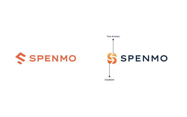 Old vs New Logo
Looking closely, you’ll notice that the ‘S’ in the logo has now transformed to reveal two arrows in the foreground and incorporated an orange gradient!
The two arrows were intended to reflect two meanings visually – the efficient movement of money and the removal of redundancies – tying it back to the promises Spenmo greatly upholds. Notice how both words “movement” and “removal” also coincide with the “mo” in Spenmo?
Instead of sticking to the old flat orange, the new gradient is now also a representation of us reaching a new depth, with newfound energy within the team that comes with it.
Perhaps you may also observe something else that has changed… something along the lines of colour?
The Colour Palette and Typography
Now that we had a gradient, we were naturally greeted with two more colour shades that complement one another.
So, we knew we had to inject an accent colour somehow. That’s where the navy blue you saw earlier comes in. Ultimately, colour psychology also states that shades of blue command trust, dependability, and respect which was necessary for Spenmo’s new brand direction. New Colour Palette
The Brand System
Of course, we wanted to ensure other elements flow nicely to accentuate this vision further. Now that we had the arrow as our main hero component, it was essential to build a more substantial brand presence and the story surrounding it moving forward.
Compared to our previous graphics, which mostly encompassed illustrations and vectors, we headed towards something a little less tyke-like and a lot more serious.

Old vs New Brand System
Thus, our choice of tonality and photography style now incorporates more professional human elements and facial expressions. With that, we seek to convey confidence and ingeniosity – just like how Spenmo sets its sight on being the forefront solution of any business’s finances and payables.
We’re pretty excited with how the layout of our new website and mobile application interface turned out too. You should be able to see this being rolled out in the next few months. Isn’t that exciting?
What’s next for Spenmo?
So, rebranding is done. But is it ever finished though?
As a matter of fact, it may only be just the beginning of a brighter, more visionary future.
We have much more work lined up for us, be it communicating this new brand to our stakeholders, changing assets, or rolling out more internal changes – but one thing’s for sure is that this new Spenmo will be a stepping stone towards its role as an iconic SaaS company in Southeast Asia.
In addition, we also have new features up and coming in our product roadmap, an integral part of a vision to streamline finance processes and remove redundancies for our customers.
Stay tuned for more updates!